Tutorial: Design Your Cover

Gale Haut

waxing digital artistic
Super Member
Registered
Joined
Jul 1, 2010
Messages
3,057
Reaction score
574
Location
The Swamplands
Website
www.galehaut.com
I'm going to do several of these tuts here to try and help all the self published authors at AW who simply do not have the monies to spend on a graphic artist.

I will update this tutorial in increments. Make sure to check back if you're interested in this stuff.


table of contents [SUP]LINKED[/SUP]
[SUP]#[/SUP]1 get graphics and images
[SUP]#[/SUP]2 software
[SUP]#[/SUP]3 starting a project
[SUP]#[/SUP]4 color
[SUP]#[/SUP]5 picture walkthrough
[SUP]#[/SUP]6 ...


Warning! Things that are especially important will appear thus. Sometimes you won't understand why they are important immediately. But trust me.

Another example of this...

Warning! I use the terms ppi and dpi interchangeably. One means pixels per inch, the other means dots per inch. The latter is a printing term. Remember back when you could see those overlapping colored dots in print media. That's where that came from.
 
Last edited:

Gale Haut

waxing digital artistic
Super Member
Registered
Joined
Jul 1, 2010
Messages
3,057
Reaction score
574
Location
The Swamplands
Website
www.galehaut.com
[SUP]#[/SUP]1 [SUP]get graphics and images[/SUP]

I personally have the luxury of being friends with an award winning local photographer and I've got an Austrian photographer/friend with some access to beautiful natural resources and a great eye for them.

Good for me. Not everyone has the luxury or pockets to get original images. So then, what are your options?

Um... Stock?

Don't worry. Everyone uses stock. Successful graphic designers sure as hell use the stuff all the time.

Take a look at some of the sites I like:
*This is a living list. PM me to add or remove resources.

free! o_O

free! o_O & for monies

not too much monies

lots of monies


Beware! Using stock will mean that your image won't be unique to your cover. Free stock is even more common to see in other works.

TIPS AND TRICKS OF THE TRADE
1. Choose an image that still looks good when it is in thumbnail size. What is thumbnail size? Think in terms of the book covers that scroll horizontally on the bottom of the Nook. If your image is a giant cover focus on a teensy tinsy baby rabbit in the middle of the page... Once it's reduced to a thumbnail, no one's gonna be able to see that.

2. Avoid too many grainy textures. Unless, that is, you are a savant at retouching photos.

This point is highly relevant to punto numero uno. When an image is resized to a smaller version, a lot of cluttered textures like a sandy beach or the severe acne on your YA cover model are going to look muddy in thumbnail size.

Also take note that texture balance in graphic design is just as complex and wonderful as color balance, as it can significantly draw a readers eye to portions of your cover. If you don't have the time to figure out how to use texture correctly, then go the route of the minimalist: don't.

3. Resolution! Listen up. This is an ebook cover. You will need an image of at least 72 ppi, which is assuming you aren't going to bloat the image and stretch it to be larger than the original in order to fit your cover.

If you ever ever ever plan on using the same image for print, you need a bigger resolution. 300ppi is the magic number for printed works. You need to pick images at the higher resolution if you plan to use them for print later on because you cannot increase an images resolution once it has been rendered in lower res.


4. If you choose more than one stock image... that's great. You're a very ambitious person. But keep in mind that when choosing images of say two people in two separate pictures to be on the same cover, you are going to have to make the photos match up so that they don't look like they are two different photos cropped together.

Think in terms of movie posters. Have you even noticed an actor/s on a poster that just doesn't seem right (head is too big or arm is sticking out like a ken doll). This is the result of a graphic designer not quite accomplishing harmony between multiple photographs. Even the pros mess it up, and often.

So don't expect it to be easy, especially if you aren't very familiar with your image manipulation software.

...


Speaking of software, that's the next chapter in this little tut series. And guess what... there are some great free options that I'm going to focus on.
 
Last edited:

Gale Haut

waxing digital artistic
Super Member
Registered
Joined
Jul 1, 2010
Messages
3,057
Reaction score
574
Location
The Swamplands
Website
www.galehaut.com
[SUP]#[/SUP]2 [SUP]software[/SUP]

I'm not going to mention all of the image manipulation and drawing software out there. If you feel I've done a major disservice by leaving something out, please let me know more about it.


COMPENDIUM

IMHO, the 3 most powerful freebies
Paint.NET
gimp
Inkscape

semi-affordable options
Pixelmator
Adobe PS Elements

barnone industry standard
Adobe Photoshop (PS)
Adobe Illustrator (AI)


Freebies! ^_^

The PS alternative, Gimp is your best bet for doing everything you need to do. It is a powerful tool that has the potential of creating professional level designs. In addition there are an endless fount of online resources for this thing. It's great. It is extremely tricky to use, though. And pretty intimidating to someone who's never used an image editor.

The PS Elements althernative, Paint.NET is the lesser child of Gimp. It does many of the same things, but then lacks essential functions such as blending modes. I highly recommend it.

The AI alternative, Inkscape isn't really the competition because it's not an image manipulation tool. It's a vector drawing tool, and an excellent additional resource for making line art on the computer. You can import files between the two programs.

Vector v. Image Manip! The difference between vector software and image manipulation software is that the latter rasterizes the image, which means it converts your lines and curves into pixels. You know how when you zoom into an image a lot it turns into a bunch of little squares? That's what I'm talking about.

A vector program won't do that. Zoom in all you want. Of course, if you upload a rasterized image into the program it will still be made of a billion little boxes. No program can convert an image back into vectors.


Lots of Monies! U_U

Photoshop, it's awesome, but hellu- expensive. It does everything you'll ever need and then some. This program is my virtual playground. One thing that makes the adobe software superior for book covers is that it has far better text manipulation options. It might take you thirty minutes to figure out how to drop a shadow or reflect a line of words in Gimp and then it only takes you about five minutes to do the same in PS.

Adobe Illustrator, the vector tool. Also awesome. Especially great for doing the text layouts on the cover. Another tool to consider for this would be In Design. Though, you could honestly do all you need in just PS if you wanted.

PS Elements, a child of Photoshop that has several of its basic features for a WHOLE lot less money.

Pixelmator, even cheaper than PS Elements and with a nicer UI. But it's only supported on the Mac, lacks CMYK mode for printing, and doesn't currently handle .psd files as well as Elements does.

...

It is entirely possible to create a beee-yootiful cover from scratch without spending a dime on software. In a sense you get what you pay for. Yes, you can do everything you need to do with some of the free alternatives, but the User Interfaces tend to be trickier to navigate and accomplishing the same tasks often require more complicated steps. So, you'll need to make an important decision before deciding what or whether to purchase expensive software. What is most valuable to you, your time or your money? Afterall, it is the end result that matters, not necessarily how you get there.

Also, you might want to consider whether you would actually be saving both time and money by hiring a professional who already has access to the software.


Next up on this tut is starting a project. Stay tuned...
 
Last edited:

Gale Haut

waxing digital artistic
Super Member
Registered
Joined
Jul 1, 2010
Messages
3,057
Reaction score
574
Location
The Swamplands
Website
www.galehaut.com
Just wanted to say that I'm still working on this tutorial and if other more experienced graphic artists notice something inaccurate or misleading please let me know. I'd like to improve both the tutorial and my own skills as much as possible.
 

Gale Haut

waxing digital artistic
Super Member
Registered
Joined
Jul 1, 2010
Messages
3,057
Reaction score
574
Location
The Swamplands
Website
www.galehaut.com
[SUP]#[/SUP]3 [SUP]starting a project[/SUP]

Most image editors have essential features in common. I will try to give a general overview here.


open sesame!

Now that you've selected an image editor you'll want to open a file for your cover. Don't directly edit your original image. You want to keep that as a back-up in case something goes wrong. Instead start a new image from scratch and then upload your images.

Create a new project under File-->New. A window will pop up with fields to fill out. You would want to use these specs for an octavo sized print ready cover: paperback.

width: 6"
height: 9" / 8"
ppi: 300

Size! If you have a traditional size already planned for print, choose that size. Otherwise, I suggest using the standard paperback size, Octavo 6" x 9".

ppi! A printed cover needs to be designed at 300 and a digital design at 72. Since you can't increase resolution, better to start a file at 300 just in case.

Voila! A blank canvas should appear in the middle of the screen.


what am i looking at??? o_O

There are three basic UI elements to every image editor worth its salt.
  • canvas
  • tools
  • layers

Right now your screen should look something like this:

gimp-screenshot.png


Of course, if you're not using gimp it will be kind of different, so don't get upset if it's not exact.

The window in the middle is your canvas. It's a blank white page. That's where you use all of the image editing tools to manipulate photos, draw pictures and write text.

The one on the left:
Portable-GIMP_1.png


This is your toolbox. It's a virtual box that holds all of the tools used to manipulate the canvas.

The one on the right:
screenshot-layers.png


These are your layers. Basically your canvas isn't just one canvas, it's a multifaceted canvas where you can stack new canvases on top of each other, change their order and cause them to effect the ones above and below in neat ways.

It's like your making a stack of transparent pages one on top of the next. You can select which page you want to draw on, one at a time. And the higher up on the list a layer is, the higher on top of the stack it is. That means if you put a solid black layer on top, you can't see anything behind it. It's called layer hierarchy.


There are a lot more complex features to these programs, but I hope that this was a decent introduction for you. For more information either see the specific documentation available for the program you are working with, or play around and find out how it works for yourself and...


have fun ^_^

Upload your cover image(s) and go to town on it. Don't worry about messing it up. You have a back-up and you also have an undo button. :D
 
Last edited:

Hiroko

Which of them was the machine?
Super Member
Registered
Joined
Aug 21, 2011
Messages
463
Reaction score
23
Location
Wherever the robots roam free
What a lovely little tutorial! Thank you.

Fortunately for me, I'm already artistically inclined and have Photoshop courtesy of my dear ol' dad, but I was kind of at a loss when it came to images (I'm not even sure of whether I'll use any or not). XD
 
Last edited:

Gale Haut

waxing digital artistic
Super Member
Registered
Joined
Jul 1, 2010
Messages
3,057
Reaction score
574
Location
The Swamplands
Website
www.galehaut.com
Cheers.

And there's more to come. Maybe you'll still learn something from the technical info. For example, the difference between CMYK and RGB, and problems that arise during conversion.
 

Gale Haut

waxing digital artistic
Super Member
Registered
Joined
Jul 1, 2010
Messages
3,057
Reaction score
574
Location
The Swamplands
Website
www.galehaut.com
[SUP]#[/SUP]3 [SUP]color[/SUP]

Testing! Please take a moment to adjust your monitor's color settings before using this tutorials.

Whether you're basing your design on a photo or designing everything out of sketches and vector graphics, there are a few techniques to choosing a color theme for your work.


complimentary colors

This is a concept that's usually taught in the middle years of a public school art class.

There are three primary colors on a wheel that transition into each other by increments. Let's take a look at the color wheel for a quick reminder.
color_wheel.gif
The complimentary colors are those that are directly opposite each other on the wheel. Therefore, red compliments green, yellow compliments violet, blue compliments orange, etc.

A color's compliment is the one most unlike it. What this means in terms of design is that these colors contrast each other as much as possible. They stand out when you use them in concert.

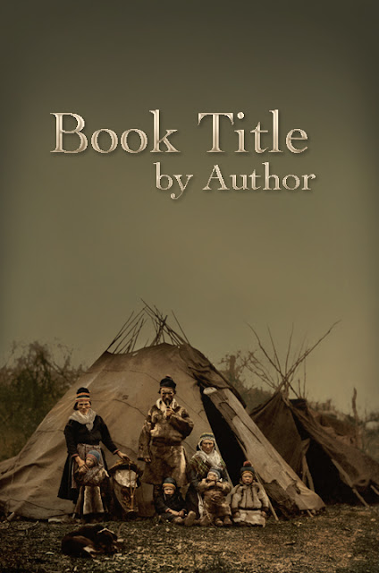
So, say that you have a red title. It would stand out against a green background better than it would on top of an orange background. Just take a look.

titleRG.jpg
titleRO.jpg

The reason being that orange is fairly close on the wheel, as it contains red. So the orange in the background blends with the red in the text. On the other hand green is as not red as you can get.

Consider! You could choose to base your color theme entirely on complimentaries. Of course, even if you don't, you should absolutely keep them in mind throughout the process of designing the cover.
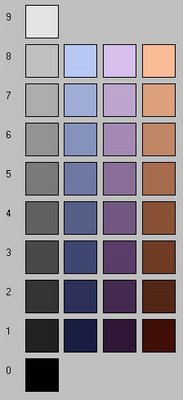


value scale
Color value is the scale used to determine how light or dark a color is. The more black a color has, the closer it approaches zero. You can see in the color drop down menu for the text editor that the colors are darker at the top and become lighter near the bottom. This is another helpful concept when trying to create color contrasts on your cover.

Here's a picture of it:
value_scale.jpg

As you may have guessed a color with more white in it will have a stronger contrast against a color that has more black in it. Let's revisit the red green example:

Similar values
titlevalueS.jpg

Medium value contrast
titleRG.jpg
Extreme value contrast
titlevalueE.jpg


So at this point we have two different contrasting scale to consider. The difference in amount of light or darkness, and the amount of difference between true color values. Well, now it's time to complicate matters further...


temperature

Did you know that color has a temperature value? That's right, and the hotter the temperature the more harshly it strikes the eye. Sadly it's not a simple hierarchy like the value scale. It's an entire spectrum. Yeesh!
533px-PlanckianLocus.png
A good way to remember it is to think of reds, yellows & oranges as being hotter colors that tend to stand out more whereas blues are cooler colors that don't boil up to the front of the page.

Also, take note that the color white has it's own temperature. Of all of the primary colors, yellow is closest to white. That's why, as you can see in the title of this subsection, yellow easily fades into a white background. It's because they have a similar color temperature.

Is this is an important concept to keep in mind when dealing with chromatics, your shades of gray. Gray scales tend to have colors added to them. Giving a gray a color adds to its temperature.

A blue-gray is cooler than a yellow-gray. So as you can see you can create contrasts or and draw attention to certain areas of the cover by varying chromatic temperatures. Here's an example I threw together.
temperatures.jpg

As you can see from this example the dark yellow gray pops to the forefront when coupled with a lighter blue gray. ETA: Actually this is a bad example because the lighter blue has a high temperature of white... I'm going to leave it though as an example of strong contrasts. Plus, I'd like to move on.


color balance techniques

There are two very similar techniques that I like to use when creating color balance for a cover.
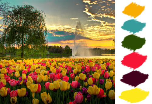
  1. Pulling colors from an image
  2. Adding colors to an image
The first technique can be used simply for creating color themes in any design even when the original image isn't used anywhere in the design.

How this is done...

It's fairly simple. What you'll do is...
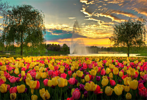
  1. pick an image with a color theme you like
  2. extract a palette of colors
  3. use what you now know about color to add text to the image
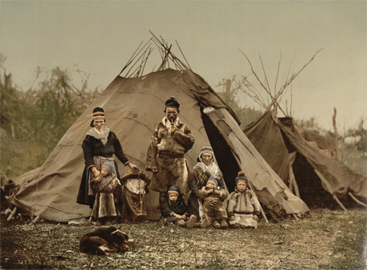
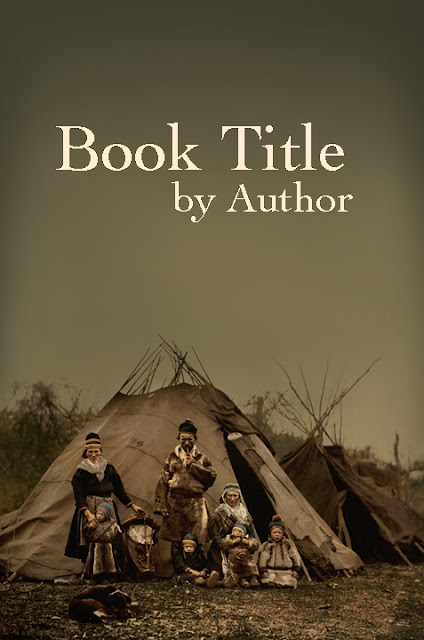

[SUP]#[/SUP]1
colorTheme.jpg


[SUP]#[/SUP]2
Extract.jpg


[SUP]#[/SUP]3
withtext.jpg

As you can see, I pulled the color of the text from the existing image. If I were to continue playing with it, I would develop a stronger & subtler contrast between the background and the text color. I'd also consider adding an outline or dropping a shadow. But as it is I just wanted to get the basic concept across.

The second technique, adding a color, is more complicated. But essentially you can use various blending modes and opacity options to add color to your image so that you can use it in other aspects of the design. It's kind of like what I did when I increased the contrast behind the the text in the example above. For example, imagine you'd like to use a purple text for the title of this image. You can actually change the color of the flowers from pinky red to the new purple color. :D
 
Last edited:

Gale Haut

waxing digital artistic
Super Member
Registered
Joined
Jul 1, 2010
Messages
3,057
Reaction score
574
Location
The Swamplands
Website
www.galehaut.com
This tut is on hiatus as I develop and work on some personal/professional projects. But in the meantime feel free to ask questions or make suggestions.
 

Anjasa

Fantasy Smut? Yes please!
Super Member
Registered
Joined
Dec 19, 2011
Messages
421
Reaction score
19
Location
NL, Canada
Thank you for this! Very good tips in here :)
 

Snowstorm

Baby plot bunneh sniffs out a clue
Super Member
Registered
Joined
Feb 26, 2008
Messages
13,722
Reaction score
1,121
Location
Wyoming mountain cabin
Holy cats, Gale. Fascinating stuff, and thank you for taking so much of your time to help AWers!
 

Gale Haut

waxing digital artistic
Super Member
Registered
Joined
Jul 1, 2010
Messages
3,057
Reaction score
574
Location
The Swamplands
Website
www.galehaut.com
That's a very nice cover, Katie. My one niggle with it is that the word "daughter" is a bit hard to read because of the dress. But I really like how she's holding the other word.
 

KatieJ

I think I'm back....
Super Member
Registered
Joined
Nov 28, 2011
Messages
547
Reaction score
75
Location
Bay of Fundy, Downeast Maine
Thanks,

I'm having a little difficulty with fonts in GIMP, but trying to work through them.... I pulled the colors from the dress, but I'd like to figure out a way to make the fonts crisper/more defined. If I can do that, then the word "Daughter" should pop out.... "should" being the operative word.

It was so helpful for you to post the tutorial you did. I really wanted to thank you for your work! And I only paid $19 for the image from Shutterstock. It was a photo and I was able to turn it into an "oil painting" with GIMP.
 

Scribe4264

Sockpuppet
Banned
Richard Paolinelli Sock
Joined
Jan 22, 2011
Messages
186
Reaction score
9
Gail,

I'd love to hear your thoughts on this sci-fi novel cover I am putting together. Here is what I have so far.


MAEILSTROM_COVERcopy.jpg
 

Gale Haut

waxing digital artistic
Super Member
Registered
Joined
Jul 1, 2010
Messages
3,057
Reaction score
574
Location
The Swamplands
Website
www.galehaut.com
Hi Scribe. The concept looks incredibly familiar. I'm not sure if it will give potential readers the impression that the book has anything new to bring to the genre. The background appears to be a fractal image that you used a filter effect on, and I like how that looks. The man in the center probably shouldn't just be gray. IDK, maybe as a whole it just lacks detail at the moment. I'd love take a look when it's done.
 

Scribe4264

Sockpuppet
Banned
Richard Paolinelli Sock
Joined
Jan 22, 2011
Messages
186
Reaction score
9
Gale,

Is this a little more on the right track?

Maelstrom_Cover_2.jpg
 
Last edited:

Gale Haut

waxing digital artistic
Super Member
Registered
Joined
Jul 1, 2010
Messages
3,057
Reaction score
574
Location
The Swamplands
Website
www.galehaut.com
[SUP]#[/SUP]4 [SUP]picture walkthrough[/SUP]

This is a simple image by image walkthrough that applies the techniques in the previous sections to create a book cover.


I select an image from commons that was in the public domain.
picture.jpg


I create a canvas proportional to an octavo book cover.
picture1.jpg


I fill the canvas by extending and naturally integrating the photo onto the entire canvas.
picture2.jpg


Tweaking the color, contrast and appearance to my own tastes and also to create a suitable contrast with the text I'll be placing.
picture3.jpg


Selecting font and positioning the text. Since this is a self published novel the author's name probably doesn't need to be visible from space unless it's a name that will garner more sales for whatever reason.
picture4.jpg


Adding fx and making the text pretty... hmm, maybe I should do a chapter on that as well.
picture5.jpg